MISSION
Completely re-design the RIT's news homepage and make it flow better and be more fit for its audience. To achieve this I went for a sleek modern look to make it more cohesive with this university’s push toward technology and innovation. I also wanted to add more visual interest to my design solution so I chose images that escape the standard frame and jump out to the user.
TOOLS USED
Illustrator
Figma
Photoshop
MY DESIGN SOLUTION
MY JOURNEY
MY INITIAL CONCEPTS
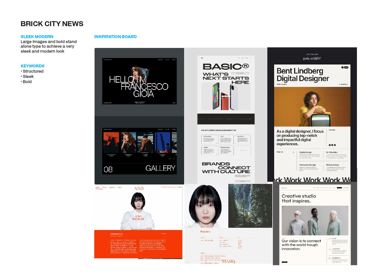
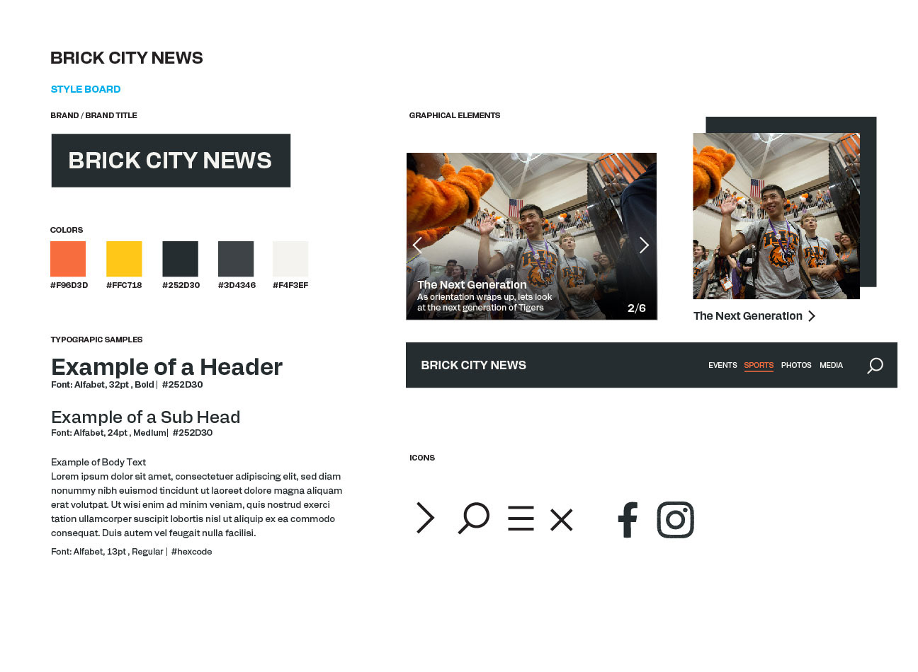
Going into my re-design, I knew I wanted to bring a fresh feel to the website that felt interesting to users instead of boring them. Since my target audience is mostly students and faculty, I made sure to use colors that pop and blocky content that was easy to navigate.
I intentionally went in two very different directions at first so I could explore what styles were working and what should I stay away from. I ended up using a combination of the two in my final design solution.
I intentionally went in two very different directions at first so I could explore what styles were working and what should I stay away from. I ended up using a combination of the two in my final design solution.




MY GRID SYSTEM
I used a 12-column and a 4px row grid system to construct my website. Using the grid, I mapped out my content to create a clean-cut structure that is easy to follow. Although I changed most of the order and structure going into my final design, I continued to follow the grid and build off the foundation I laid out initially.
RESEARCH
To figure out the order of my content I looked at data compiled by the university to see what type of content people were looking for. From the data, an overwhelming amount of people were interested in the events happening at RIT, however, the current website barely has information on it. My design prioritizes the content users want to see while keeping in mind the goals the original website wanted to accomplish.
